Employment projects
Some examples of the projects I have worked on while being employed. I have worked mostly on websites, social media posts, email marketing, logos, icons, leaflets, posters and packaging.
Email: gracefarey@hotmail.co.uk
Tel: 07872 550716
Email Marketing
I created these marketing emails on Mailchimp while I was an in-house Graphic Designer for Makers & Merchants, a company in Somerset. I made sure I kept brand constancy using the brand’s colour palette, tone of voice and fonts.
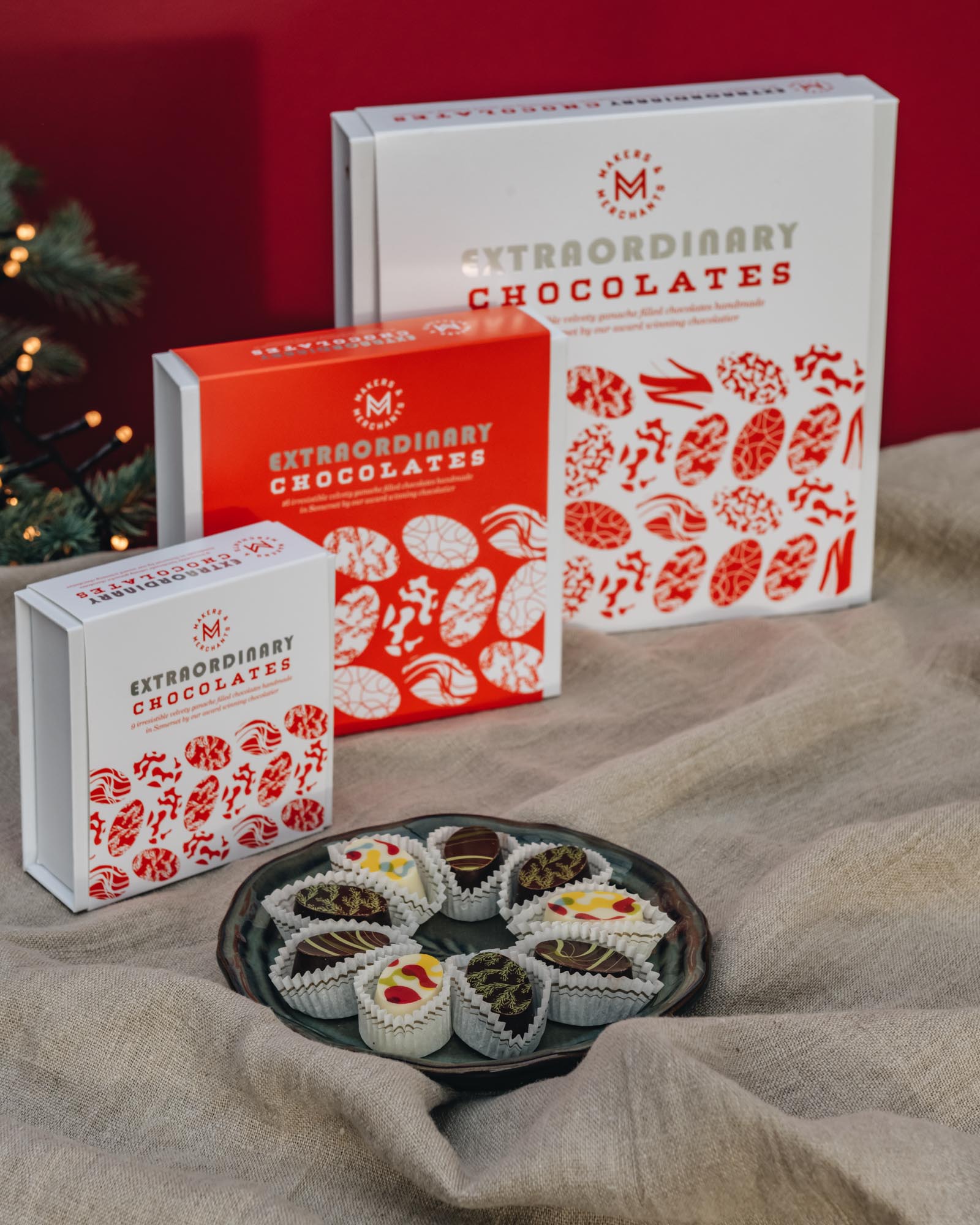
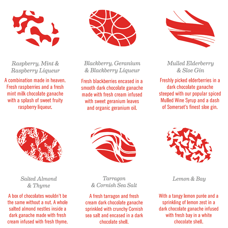
Product Packaging
Extraordinary Chocolate packaging was a recent project I worked on for Makers & Merchants. The packaging needed to reflect the beauty of the handmade chocolate patterns, while sticking to the brand guidelines. These chocolates are now selling at Burford Garden Center (this photograph was taken by Burford Garden Center).
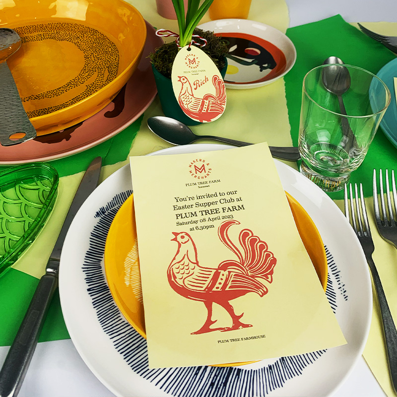
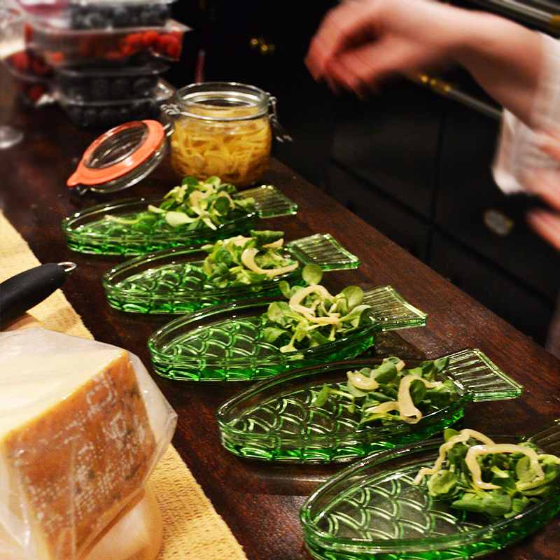
Simple Photograpghy Shoots
Makers & Merchants often host Supper Clubs for paying guests. I created menus, place name cards and invites for an Easter Supper Club in 2023.
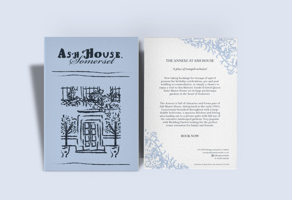
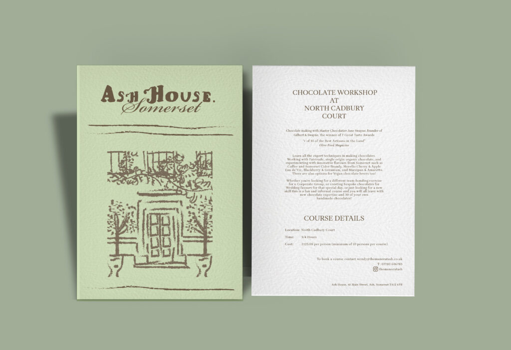
Event Flyers
An external client wanted some flyers created to advertise her Chocolate Courses and Airbnb Annexe. She wanted an illustration of her home as part of her branding as well as vintage typography to capture the age of the building. I created these two flyers for her.
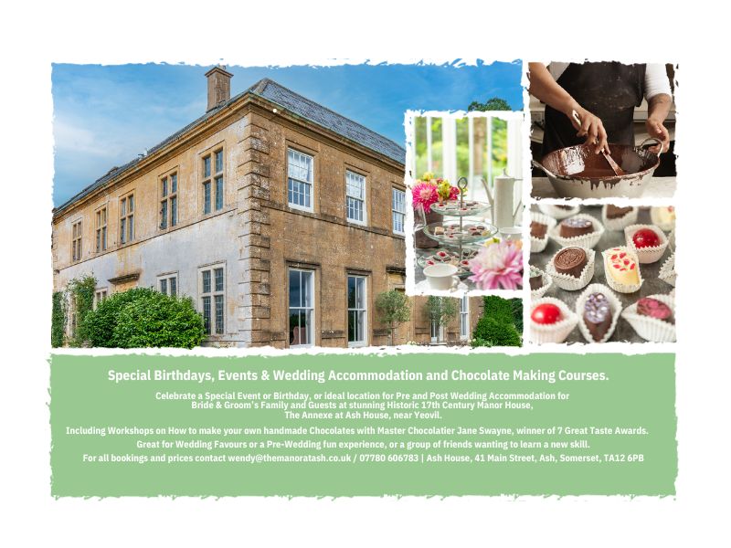
For the same external client, I created an advert to be published in a Country Life magazine.
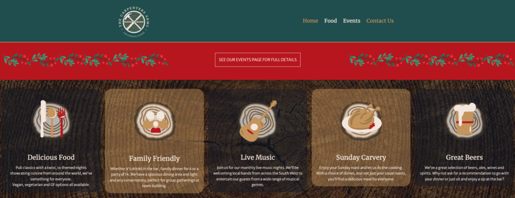
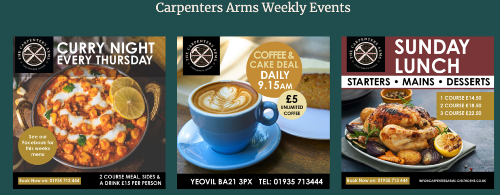
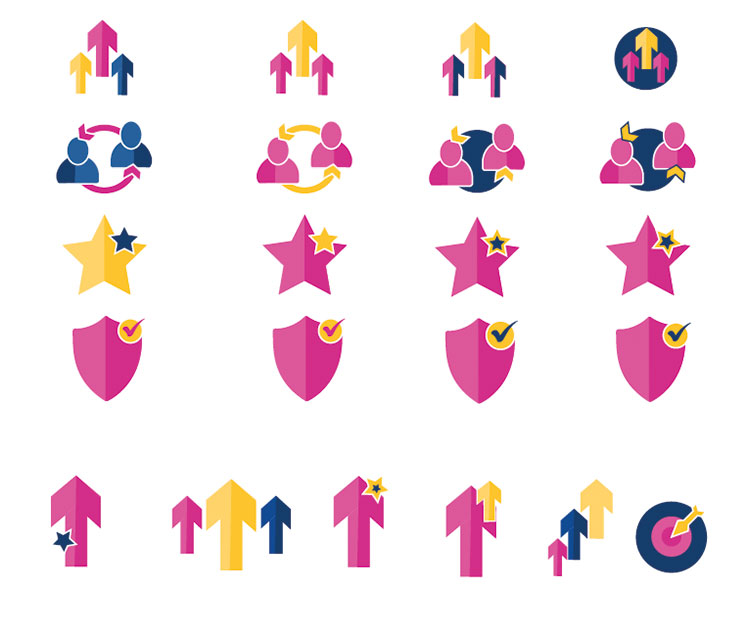
The Carpenters Arms- Local Pub
I created six icons that represented the pub’s key selling points.
These are featured on their website. I made these on Illustrator and kept to the brand colour palette.


Website Pages
Some examples of icons and website layouts I participated in:
.This involved editing photos to the correct size for the website
.Creating icons for products and buttons
.Text and image placement
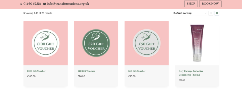
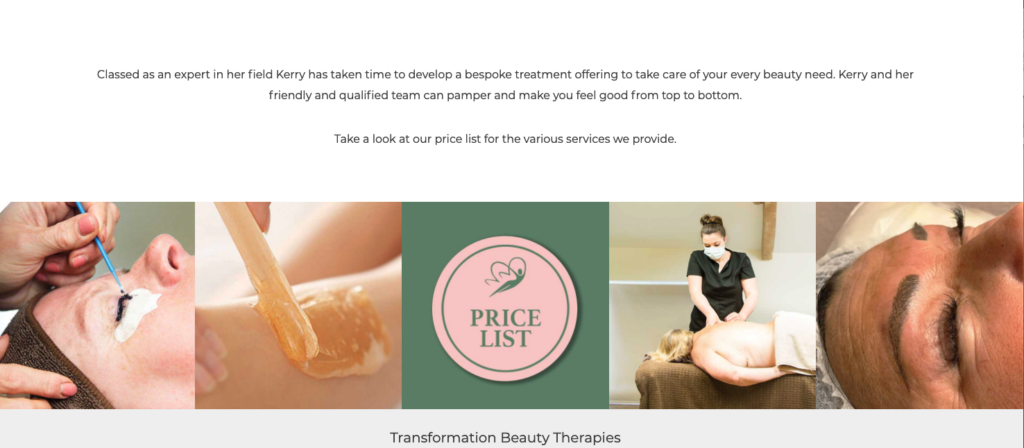
Transformations – Beauty website
Furness Academy
The client asked for icons that represented the school’s morals.
I made the icons in Illustrator and kept to the school’s colour palette.
The chosen icons.
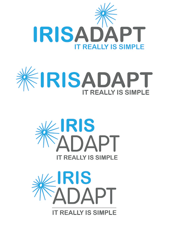
Iris Adapt- Software company
The client wanted their logo to be recreated. I recreated the star shape and then used
the pen tool to pull the anchor points to the shape of an off-centre oval.
After emailing Iris Adapt, they decided they wanted a darker grey colour and a more rounded font.